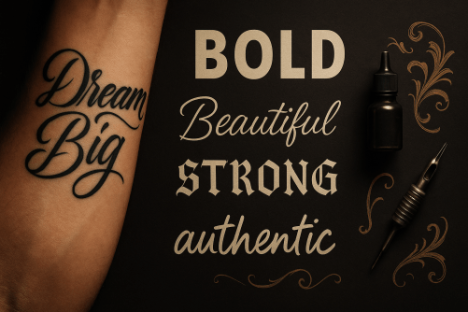
Whether it’s a meaningful quote wrapped around your wrist, your child’s name across your chest, or a powerful word that defines your journey, the right font doesn’t just display your message â it amplifies your story, whispers your personality, and ensures your ink speaks the language of your heart.
Understanding Tattoo Typography: More Than Just Pretty Letters
When we talk about tattoo fonts, we’re diving into a world where art meets permanence. Unlike choosing fonts for a website or poster, selecting typography for body art requires careful consideration of how letters will age, how they’ll look at different sizes, and how they’ll complement the natural curves of your body.
The Psychology Behind Font Choice
Every font family carries its own emotional weight. Script fonts whisper elegance and femininity, while bold sans-serif typefaces shout strength and modernity. Gothic lettering speaks of mystery and tradition, and handwritten styles feel personal and intimate. Understanding these psychological connections helps you choose fonts that truly represent who you are.
Key Considerations for Tattoo Fonts
Before diving into our extensive collection of free tattoo fonts, let’s explore what makes typography work well for body art:
Readability Over Time: Your skin changes as you age. Fonts with thin lines or intricate details might not hold up as well as bolder, simpler designs. Consider how your chosen font will look in 10, 20, or 30 years.
Size and Placement: Small, delicate fonts work beautifully for finger tattoos or behind-the-ear placements, while larger, bolder fonts suit chest pieces or back tattoos. The placement dictates the font choice, not the other way around.
Body Contours: Your body isn’t flat like a piece of paper. Good tattoo fonts flow with your natural curves rather than fighting against them. Consider how letters will bend around muscles, bones, and joints.
Artistic Harmony: If you’re adding text to an existing tattoo or planning a larger piece, your font choice should complement other design elements rather than compete with them.
Top Categories of Free Tattoo Fonts
Script and Cursive Fonts
Script fonts remain the most popular choice for tattoo typography, and for good reason. They offer elegance, flow, and a timeless appeal that works beautifully for quotes, names, and meaningful phrases.
Best Free Script Options:
- Allura â A flowing script that works perfectly for longer quotes
- Dancing Script â Casual and friendly, ideal for personal mantras
- Great Vibes â Elegant and sophisticated, perfect for formal quotes
- Pacifico â Relaxed and approachable, great for beach-themed pieces
- Satisfy â Handwritten feel, excellent for personal messages
These script fonts offer varying levels of formality and flow. Allura works beautifully for wedding dates or romantic quotes, while Pacifico brings a laid-back California vibe to surf-related tattoos.
Bold and Sans-Serif Fonts
For those seeking modern, clean lines and maximum readability, sans-serif fonts deliver powerful impact. These fonts work exceptionally well for single words, short phrases, or geometric tattoo designs.
Top Bold Font Choices:
- Oswald â Strong and condensed, perfect for vertical text
- Bebas Neue â Ultra-bold and commanding attention
- Anton â Compressed and powerful, ideal for impactful words
- Fjalla One â Clean and readable, works at any size
- Russo One â Rounded edges with serious presence
Bold fonts excel in areas where you want maximum impact with minimal space. They’re particularly effective for motivational words, coordinates, or geometric designs where the text becomes part of the overall artistic composition.
Gothic and Old English Fonts
Gothic typography brings historical weight and dramatic flair to tattoo designs. These fonts work particularly well for religious text, traditional imagery, or when you want to evoke a sense of timeless gravitas.
Classic Gothic Options:
- UnifrakturMaguntia â Traditional German blackletter style
- Kingthings Calligraphica â Medieval manuscript inspiration
- Morris Roman â Arts and crafts movement influence
- Cloister Black â Classic Old English newspaper style
- Linotext â Modern take on traditional gothic forms
Gothic fonts require careful consideration of size and placement. They work beautifully for larger pieces but can become illegible when scaled down too small. Consider your tattoo artist’s experience with detailed line work when choosing these intricate styles.
Handwritten and Brush Fonts
Nothing feels more personal than handwritten-style fonts. These typefaces bring intimacy and authenticity to tattoo designs, making them perfect for personal mantras, loved ones’ names, or meaningful quotes.
Authentic Handwritten Styles:
- Kalam â Natural handwriting with personality
- Caveat â Casual and approachable brush script
- Permanent Marker â Bold marker-style lettering
- Architects Daughter â Playful architectural lettering
- Shadows Into Light â Delicate and feminine handwriting
Handwritten fonts work exceptionally well for memorial tattoos, children’s names, or any text that should feel deeply personal. They pair beautifully with watercolor techniques or realistic portrait work.
Decorative and Specialty Fonts
For unique tattoo designs that need something beyond traditional categories, decorative fonts offer unlimited creative possibilities. These fonts often incorporate design elements directly into the letterforms.
Creative Specialty Options:
- Creepster â Horror movie poster inspiration
- Eater â Distressed and weathered appearance
- Nosifer â Zombie apocalypse aesthetic
- Butcherman â Rough, hand-carved appearance
- Metal Mania â Heavy metal band aesthetic
Specialty fonts work best when they align perfectly with your tattoo’s theme. A horror-themed sleeve might benefit from Creepster, while a music-themed piece could incorporate Metal Mania for band names or song titles.
Where to Find High-Quality Free Tattoo Fonts
Google Fonts: The Gold Standard
Google Fonts offers the largest collection of high-quality, free fonts available online. Every font in their library is open-source and free for commercial use, making them perfect for tattoo applications.
Navigation Tips:
- Use the filter options to narrow down by style (serif, sans-serif, display, handwriting)
- Preview fonts at different sizes to see how they’ll scale
- Download font families that include multiple weights and styles
Font Squirrel: Curated Quality
Font Squirrel specializes in high-quality free fonts that are cleared for commercial use. Their “Fontface Generator”; tool helps convert fonts into different formats if needed.
Key Features:
- All fonts are legally cleared for commercial use
- High-quality typography from professional designers
- Excellent search and filtering capabilities
- Detailed licensing information for each font
DaFont: Massive Variety
DaFont hosts one of the internet’s largest collections of free fonts, including many specialty and decorative options perfect for unique tattoo designs.
Best Practices for DaFont:
- Always check licensing before using fonts commercially
- Look for fonts marked “Free for personal use”;
- Download from verified uploaders when possible
- Preview fonts carefully as quality varies
1001 Fonts: Organized Collections
1001 Fonts organizes their massive collection into helpful categories, making it easier to find fonts that suit your specific tattoo style.
Navigation Advantages:
- Category-based browsing (tattoo, gothic, script, etc.)
- User ratings and reviews for popular fonts
- Multiple download formats available
- Regular updates with new font releases
Font Pairing and Combination Strategies
Mixing Font Styles Effectively
Combining different fonts in a single tattoo design requires careful consideration of visual hierarchy and artistic balance. The key is creating contrast without chaos.
Successful Pairing Principles:
Script + Sans-Serif: Pair an elegant script for the main message with a clean sans-serif for supporting text like dates or locations. This combination offers both elegance and readability.
Bold + Light: Use a bold font for emphasis words and a lighter weight for supporting text. This creates clear visual hierarchy while maintaining cohesion.
Decorative + Simple: If using a highly decorative font for key words, balance it with simple, readable fonts for longer text passages.
Creating Visual Hierarchy
Not all text in your tattoo needs equal weight. Create visual interest and improve readability by establishing clear hierarchy through font choices.
Primary Text: Use your most impactful font for the main message Secondary Text: Choose complementary but subdued fonts for supporting information Accent Text: Small details like dates or initials can use decorative touches
Size and Scale Considerations
Different fonts perform differently at various sizes. Script fonts might become illegible when very small, while bold sans-serif fonts might overwhelm delicate design elements when too large.
Size Guidelines:
- Test fonts at actual tattoo size before committing
- Consider viewing distance (finger tattoos vs. back pieces)
- Account for skin texture and healing effects on thin lines
Technical Considerations for Tattoo Typography
Line Weight and Thickness
Tattoo ink spreads slightly under the skin over time, a phenomenon called “blowout.”; Choose fonts with appropriate line weights that will maintain their integrity as they age.
Optimal Line Weights:
- Minimum line thickness should be at least 2-3mm for longevity
- Avoid fonts with extremely thin decorative elements
- Consider how line weight affects readability at different distances
Spacing and Kerning
Proper letter spacing becomes crucial in tattoo applications where readability must last decades. Poor spacing can cause letters to blur together or create awkward gaps.
Spacing Best Practices:
- Increase letter spacing slightly compared to print applications
- Ensure adequate space between lines for multi-line tattoos
- Test spacing at actual tattoo size before finalizing design
Skin Tone and Contrast Considerations
Different skin tones affect how tattoo fonts appear. What looks crisp on paper might lack contrast on certain skin types.
Contrast Solutions:
- Consider outline fonts for lighter skin tones
- Solid fill fonts often provide better contrast on darker skin
- Discuss color options with your tattoo artist for optimal visibility
Popular Tattoo Font Trends in 2025
Minimalist Typography
Clean, simple fonts continue dominating tattoo trends. Minimalist typography focuses on essential elements, creating timeless designs that age gracefully.
Trending Minimalist Fonts:
- Ultra-thin line weights
- Geometric letterforms
- Excessive negative space
- Single-word statements
Hand-Lettered Aesthetics
Custom hand-lettering and fonts that mimic natural handwriting are increasingly popular, especially for personal and memorial tattoos.
Hand-Lettered Characteristics:
- Imperfect letter forms that feel authentic
- Variable line weights within single letters
- Natural flow and connection between characters
- Personal signature-style appearance
Vintage Revival Styles
Fonts inspired by vintage signage, old movie posters, and historical typography are making strong comebacks in tattoo culture.
Popular Vintage Styles:
- Art Deco letterforms from the 1920s-1930s
- Mid-century modern sans-serif fonts
- Vintage script fonts from old advertisements
- Retro gaming and arcade-inspired typography
Cultural and International Influences
Modern tattoo typography increasingly incorporates fonts inspired by different cultures and writing systems, even when rendered in Latin characters.
Cultural Font Influences:
- Japanese calligraphy-inspired letterforms
- Arabic script aesthetic adapted for English text
- Celtic knot work integrated into letter design
- Native American artistic influences
Customization and Modification Tips
Working with Your Tattoo Artist
Your tattoo artist is your best partner in font customization. Professional tattoo artists understand how different fonts translate to skin and can suggest modifications for optimal results.
Artist Collaboration Tips:
- Bring multiple font options to your consultation
- Discuss size and placement implications
- Trust your artist’s experience with font readability
- Be open to suggested modifications for better longevity
Digital Modification Techniques
Before heading to your tattoo appointment, you can make digital modifications to improve how fonts work for your specific design.
Useful Modifications:
- Increase line weights for better aging
- Adjust letter spacing for improved readability
- Remove excessive decorative elements that might not translate well
- Combine elements from different fonts to create unique lettering
Creating Custom Letterforms
For truly unique tattoos, consider creating custom letterforms that incorporate personal meaning or artistic elements specific to your design.
Custom Design Approaches:
- Modify existing fonts to include personal symbols
- Integrate decorative elements that relate to your tattoo’s theme
- Create ligatures (connected letters) for names or meaningful words
- Develop signature letterforms for initials or monograms
Legal and Licensing Considerations
Understanding Font Licenses
Not all fonts are free for commercial use, and tattoos can sometimes fall into commercial categories depending on circumstances.
License Types:
- Free for Personal Use: Generally acceptable for personal tattoos
- Open Source: Usually allows any use including commercial applications
- Commercial License Required: May require payment for tattoo use
- Custom License: Varies by font creator’s specific terms
Safe Font Sources
Stick to reputable sources that clearly indicate licensing terms to avoid legal complications.
Recommended Safe Sources:
- Google Fonts (all open source)
- Font Squirrel (commercial use cleared)
- Official foundry websites with clear licensing
- Open-source font repositories
When to Purchase Fonts
Some exceptional fonts are worth purchasing, especially for significant tattoos that will be with you for life.
Consider Purchasing When:
- The perfect font isn’t available for free
- You want exclusive or limited-distribution fonts
- Supporting font designers is important to you
- You need extensive font families with multiple weights
Size and Placement Guidelines
Optimal Sizes for Different Body Areas
Different body areas accommodate different font sizes and styles. Understanding these limitations helps ensure your tattoo remains readable and aesthetically pleasing.
Size Recommendations by Placement:
Fingers: 8-12pt fonts maximum, stick to simple, bold fonts Wrists: 12-16pt fonts, script fonts work well here Forearms: 16-24pt fonts, most font styles work effectively Chest: 18-36pt fonts, room for decorative and script fonts Back: 24-48pt fonts, perfect for elaborate typography Ribs: 14-20pt fonts, consider body curve when designing
Readability Distance Factors
Consider who needs to read your tattoo and from what distance. Personal mantras might only need to be readable by you, while larger statement pieces should be legible from conversational distance.
Distance Guidelines:
- Personal reading distance: 12-18 inches
- Conversational distance: 3-6 feet
- Display distance: 6+ feet
Anatomical Considerations
Your body’s natural contours affect how fonts appear and age. Consider how muscles, joints, and skin elasticity will impact your chosen typography over time.
Body Contour Factors:
- Curved surfaces may distort straight-line fonts
- Joint areas experience more skin movement
- Muscle growth/loss affects tattoo appearance
- Skin elasticity varies by body area and age
Color and Contrast in Typography Tattoos
Traditional Black Ink Approaches
Black ink remains the gold standard for typography tattoos due to its excellent contrast and longevity. Different black ink techniques create various effects with fonts.
Black Ink Techniques:
- Solid Fill: Maximum contrast and readability
- Outline Only: Clean, minimalist appearance
- Gradient Fill: Artistic depth while maintaining readability
- Textured Fill: Adds visual interest without compromising legibility
Color Typography Considerations
Color can enhance typography tattoos but requires careful consideration of how different colors age and maintain visibility.
Color Best Practices:
- Red and black combinations offer excellent contrast
- Avoid light colors (yellow, pink) for primary text
- Consider color blindness when choosing color combinations
- Understand how colors fade differently over time
Background and Negative Space
The space around your typography is as important as the letters themselves. Proper use of negative space improves readability and creates visual impact.
Negative Space Strategies:
- Ensure adequate space around letters for aging
- Use background elements to frame text without overwhelming
- Consider how surrounding tattoos will affect text visibility
- Plan for potential future tattoo additions
Maintenance and Longevity
How Fonts Age in Tattoos
Different font styles age differently on skin. Understanding these patterns helps you choose fonts that will maintain their impact over decades.
Aging Patterns:
- Thin Lines: May become thicker due to ink spread
- Detailed Elements: Might lose definition over time
- Bold Fonts: Generally maintain integrity better
- Script Fonts: Delicate elements may require touch-ups
Touch-Up Considerations
Plan for the possibility of touch-ups to maintain your typography tattoo’s appearance over time.
Touch-Up Planning:
- Choose fonts that touch up easily
- Maintain relationships with skilled tattoo artists
- Document original font choices for future reference
- Budget for maintenance appointments
Skin Care for Typography Tattoos
Proper aftercare and ongoing skin maintenance significantly impact how well typography tattoos age.
Maintenance Tips:
- Use high-quality sunscreen to prevent fading
- Moisturize regularly to maintain skin elasticity
- Avoid extreme weight fluctuations when possible
- Follow professional aftercare instructions carefully
Common Typography Tattoo Mistakes to Avoid
Sizing Errors
One of the most common mistakes is choosing fonts that are too small or too large for their intended placement.
Sizing Mistakes:
- Text too small to age well
- Overwhelming large fonts that dominate other design elements
- Inconsistent sizing between related text elements
- Ignoring body proportions when determining size
Poor Font Choices for Skin
Some fonts that look beautiful on paper or screen translate poorly to skin applications.
Problematic Font Characteristics:
- Extremely thin line weights
- Excessive decorative details
- Poor contrast between thick and thin strokes
- Fonts designed specifically for digital use only
Placement Problems
Even perfect fonts can fail when placed inappropriately on the body.
Placement Issues:
- Ignoring natural body contours
- Placing text across joint areas that stretch frequently
- Choosing areas with poor visibility for important messages
- Failing to consider how clothing will interact with text placement
Spelling and Grammar Errors
Nothing ruins a beautiful typography tattoo like spelling or grammatical mistakes.
Prevention Strategies:
- Triple-check all spelling before your appointment
- Have multiple people review text for errors
- Verify accuracy of foreign language text with native speakers
- Double-check dates, names, and numerical information
Typography in Different Tattoo Styles
Traditional American Style
Traditional American tattoos have specific typography conventions that complement the bold, iconic imagery of this classic style.
Traditional Font Characteristics:
- Bold, readable serif or sans-serif fonts
- Simple, clean letterforms without excessive decoration
- High contrast between letters and background
- Fonts that complement classic imagery (anchors, roses, eagles)
Neo-Traditional Adaptations
Neo-traditional tattoos allow for more experimental typography while maintaining the bold readability of traditional work.
Neo-Traditional Typography:
- Modern interpretations of classic fonts
- Integration of decorative elements into letterforms
- Color integration with typography
- More complex font combinations
Realism and Typography Integration
Photorealistic tattoos can incorporate typography in subtle, artistic ways that enhance rather than compete with realistic imagery.
Realism Typography Techniques:
- Text integrated into realistic scenes (street signs, book pages)
- Subtle text placement that doesn’t disrupt realistic flow
- Font choices that match the era or setting of realistic elements
- Typography as environmental elements within realistic compositions
Geometric and Modern Styles
Contemporary geometric tattoos often feature typography that aligns with clean, mathematical aesthetic principles.
Geometric Typography:
- Sans-serif fonts with precise, clean lines
- Typography integrated into geometric patterns
- Modular font systems that complement geometric designs
- Mathematical precision in letter spacing and sizing
Cultural Sensitivity in Font Selection
Understanding Cultural Context
When choosing fonts inspired by different cultures, it’s important to understand their cultural significance and use them respectfully.
Cultural Considerations:
- Research the historical context of culturally-inspired fonts
- Understand the difference between appreciation and appropriation
- Consider consulting with people from relevant cultural backgrounds
- Choose fonts that honor rather than stereotype cultural elements
Avoiding Appropriation
Some font styles carry deep cultural significance that goes beyond mere aesthetic choice.
Respectful Practices:
- Avoid using sacred or ceremonial text styles casually
- Research the cultural significance of font styles before using
- Consider whether your use honors or trivializes cultural elements
- When in doubt, choose culturally neutral alternatives
International Typography
If incorporating text in languages other than English, ensure accuracy and cultural appropriateness.
International Text Guidelines:
- Work with native speakers to verify accuracy
- Understand cultural connotations of chosen phrases
- Ensure proper grammar and syntax in foreign languages
- Consider how different writing systems affect tattoo design
Technology and Typography Tattoos
Digital Tools for Font Testing
Modern technology offers powerful tools for previewing how fonts will look in tattoo applications.
Useful Digital Tools:
- Photoshop: Create mockups at actual size
- Procreate: Sketch and test fonts on tablet devices
- Font preview websites: Test fonts at various sizes
- AR tattoo apps: Preview fonts on your actual body
Future-Proofing Your Typography
Consider how current font trends might be viewed in the future when making permanent typographic choices.
Future-Proofing Strategies:
- Choose classic fonts over extremely trendy options
- Focus on personal meaning rather than current popularity
- Consider how fonts might be viewed in 10-20 years
- Balance contemporary appeal with timeless design principles
3D and Special Effects
Modern tattoo techniques allow for three-dimensional effects and special visual treatments that can enhance typography.
Advanced Typography Effects:
- Drop shadows: Add depth to letterforms
- 3D letterforms: Create illusion of dimensional text
- Textural effects: Integrate texture into font design
- Lighting effects: Use shading to create dramatic impact
Building Your Typography Tattoo Vision
Creating a Mood Board
Before finalizing your typography tattoo, create a comprehensive mood board that captures your vision.
Mood Board Elements:
- Font samples at various sizes
- Color palette options
- Reference images of similar tattoos
- Inspiration images that capture desired mood
- Placement reference photos
Consultation Preparation
Prepare thoroughly for your tattoo consultation to make the most of your artist’s expertise.
Consultation Checklist:
- Bring multiple font options printed at actual size
- Include reference images of desired style
- Prepare questions about font modification possibilities
- Discuss size and placement options
- Review artist’s portfolio for typography experience
Timeline and Planning
Typography tattoos require careful planning and often multiple sessions for complex designs.
Planning Timeline:
- Initial consultation: 2-4 weeks before tattoo appointment
- Design refinement: 1-2 weeks for modifications
- Final approval: At least 1 week before appointment
- Touch-up planning: Schedule follow-up 4-6 weeks after initial session
Conclusion: Making Your Mark with Perfect Typography
Choosing the right font for your tattoo is about more than aesthetics â it’s about finding the perfect voice for your story. The typography you choose will speak for you every day, conveying not just your message but your personality, values, and style. Whether you’re drawn to the flowing elegance of script fonts, the bold confidence of sans-serif typography, the historical weight of gothic lettering, or the personal intimacy of handwritten styles, the perfect font exists for your vision.
Remember that the best tattoo fonts balance beauty with practicality, personal meaning with universal appeal, and current style with timeless design. Take time to explore the vast world of free typography available, test fonts at actual sizes, and work closely with a skilled tattoo artist who understands how different fonts translate to skin.
Your tattoo is a permanent expression of who you are. Make sure the typography you choose tells your story with the clarity, beauty, and impact it deserves. With the right font choice, your words won’t just be read â they’ll be felt, remembered, and treasured for a lifetime.
The world of free tattoo fonts offers endless possibilities for creating meaningful, beautiful, and lasting typographic art. Whether you’re planning your first text tattoo or adding to an existing collection, the perfect font is out there waiting to give voice to your vision. Take your time, do your research, and choose the typography that will make your mark on the world â and on your skin â truly unforgettable.